Case Study: eCycle

Role

UX/UI Designer

Industry

Technology & Transport

Duration

3 months

eCycle logo and a bike

Stage 1. User Research

Developed user personas to understand the needs of e-bike rental users. Lara Bailey, a 21-year-old student, highlighted key frustrations such as bike availability and app battery drain. Her goals include timely arrivals, cost savings, and flexible payment options. Analyzing these personas helped pinpoint essential features for a seamless and engaging rental experience, focusing on clear tutorials, efficient navigation, and flexible payment methods.

Stage 2. Ideation & Conceptualization

Formulated a redesign strategy that prioritizes a simplified user flow, enhanced data visualization for goal tracking, and new features to foster community engagement among users. Developed a detailed design roadmap, categorizing changes into short-term fixes and long-term enhancements, to guide the redesign efforts effectively.

Stage 3. Design Execution

Developed both low-fidelity and high-fidelity wireframes for the eCycle app. The design focused on a clean interface, intuitive navigation, and easy access to rental stations and payment options. Key features included a tutorial for new users, quick checkout for experienced users, and integration of flexible payment methods. The color scheme utilized teal green for eco-friendliness and blue for energy, reflecting the app’s brand personality.

Stage 1. User Research

Developed user personas to understand the needs of e-bike rental users. Lara Bailey, a 21-year-old student, highlighted key frustrations such as bike availability and app battery drain. Her goals include timely arrivals, cost savings, and flexible payment options. Analyzing these personas helped pinpoint essential features for a seamless and engaging rental experience, focusing on clear tutorials, efficient navigation, and flexible payment methods.

Stage 2. Ideation & Conceptualization

Formulated a redesign strategy that prioritizes a simplified user flow, enhanced data visualization for goal tracking, and new features to foster community engagement among users. Developed a detailed design roadmap, categorizing changes into short-term fixes and long-term enhancements, to guide the redesign efforts effectively.

Stage 3. Design Execution

Developed both low-fidelity and high-fidelity wireframes for the eCycle app. The design focused on a clean interface, intuitive navigation, and easy access to rental stations and payment options. Key features included a tutorial for new users, quick checkout for experienced users, and integration of flexible payment methods. The color scheme utilized teal green for eco-friendliness and blue for energy, reflecting the app’s brand personality.

Stage 4. User Testing & Iterations

Conducted user testing to refine the app’s functionality and design. Feedback emphasized the importance of a simple rental process and reliable app performance. Iterations focused on improving battery efficiency, enhancing the map interface, and ensuring that users could easily view their rental history and manage bookings. Adjustments were made based on real user experiences to ensure the app met the needs of both new and experienced users.

Stage 5. Final Presentation and Documentation

Compiled a comprehensive presentation and documentation, including a brand guide and design details. The documentation showcased the development process, from initial sketches to final high-fidelity designs, and included an overview of key features and user flow. The brand guide detailed the logo design, emphasizing simplicity and the eco-friendly and energetic qualities of the app.

Reflections

The project underscored the importance of balancing simplicity with functionality. User research highlighted the need for a clear, step-by-step guide and intuitive navigation, addressing common frustrations with existing e-bike rental apps. Competitive analysis emphasized the value of including tutorials, ride history, and flexible payment options. User feedback during testing confirmed that efficient app performance and a user-friendly design were crucial for a successful e-bike rental experience. The final design reflects a commitment to ease of use, customization, and enhancing the overall user experience.

Reflections

The project underscored the importance of balancing simplicity with functionality. User research highlighted the need for a clear, step-by-step guide and intuitive navigation, addressing common frustrations with existing e-bike rental apps. Competitive analysis emphasized the value of including tutorials, ride history, and flexible payment options. User feedback during testing confirmed that efficient app performance and a user-friendly design were crucial for a successful e-bike rental experience. The final design reflects a commitment to ease of use, customization, and enhancing the overall user experience.

Other projects

Rebrand & Website Redesign: Next Pulse Marketing

Refreshing the brand identity and building a modern, AI-focused website with a sleek logo, bold colors, and a futuristic user experience.
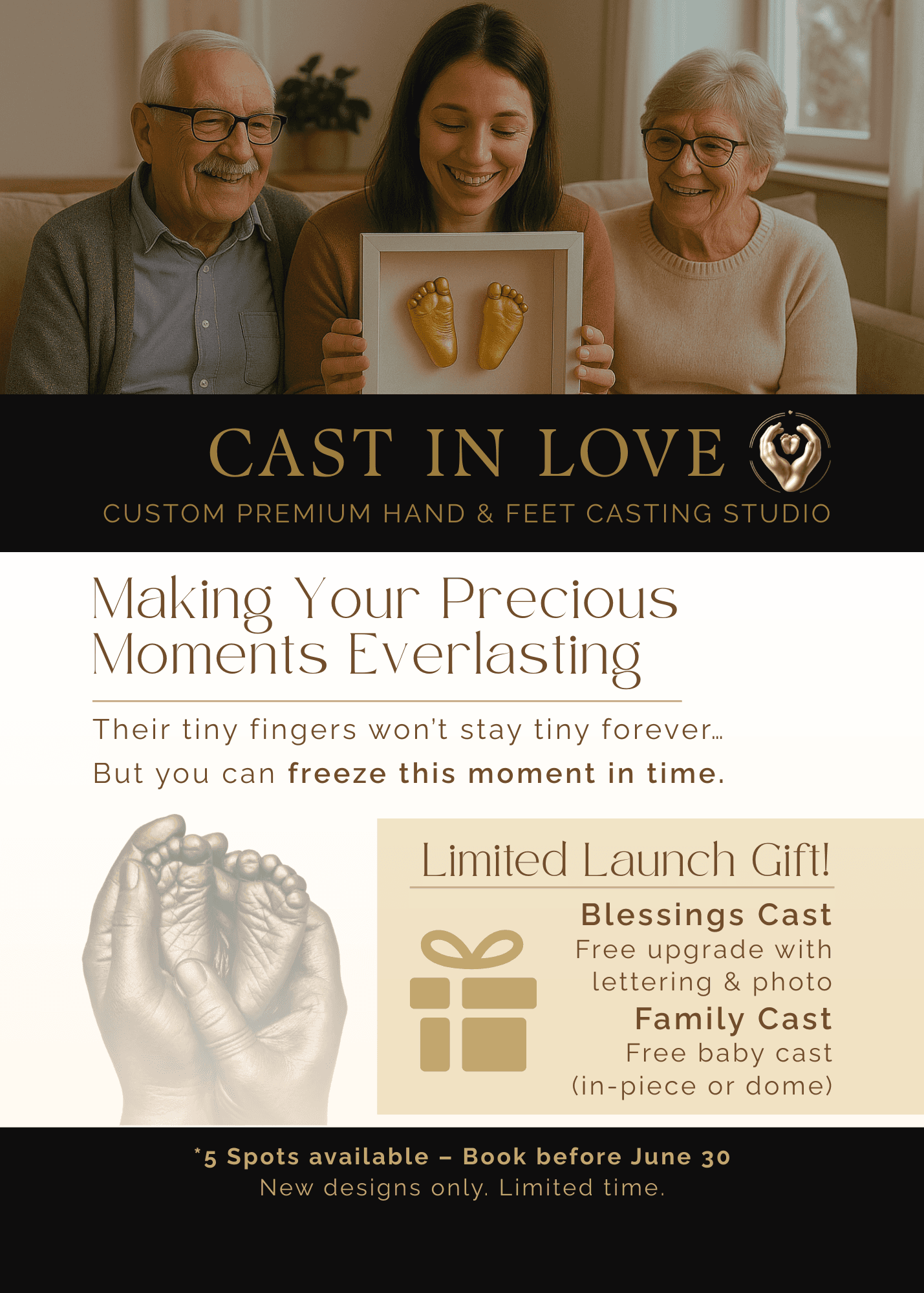
Print Marketing Design for Cast In Love

Print and promotional materials for a hand casting studio focused on emotional storytelling and seasonal campaigns.

5 Fun & Unique GTA Activities – Local Discovery Carousel

Content-driven social media post created to engage local audiences and promote Cast In Love through helpful, shareable content.

Brand & Website: Next Pulse Marketing

Developing a bold visual identity and modern website for a growing marketing agency, with a focus on clean design, intuitive navigation, and a tech-forward feel.

Photo Sorting App: Pixel Pond

Designing an app that will provide all users with a fun and quick way to sort photos and free up space on their devices.

Chupa Rebrand Cover
Chupa Rebrand Cover
Chupa Rebrand Cover

Graduation project: Chupa Chups Rebrand & UX

Update the Chupa Chups brand to appeal to a wider range of demographics, including older consumers, by modernizing its aesthetic and UX designs.

New Vape Flavor: Mexican Mango

Design a logo and packaging for a new vape flavor.

Ferrero Rocher Motion Package & Brief

Designing a Motion Package in After Effects for Ferrero Rocher's baking workshops.

Logo Development: Chupa Chups

Redesigning an exisiting logo.

Logo Development: Next Pulse Marketing

New logo design process.

XP Bottle Storyboard

Diegetic UI Element: XP Bottle

Creating a unique diegetic user interface element using multiple inspirations.

Animated Personal Logo

Logo animation loop created in After Effects.

Maya: 3D Breakfast Scene

Created 3D props and textures from scratch to create a realistic breakfast scene.

Stylized Profile Images

Created unique variations of profile picture for a client, utilizing multiple layers and textures.

Animated Poster Loop

Animated Poster Loop created in After Effects.

Viktoriya Epifantseva

Viktoriya Epifantseva

Viktoriya Epifantseva

Create a free website with Framer, the website builder loved by startups, designers and agencies.