Graduation project: Chupa Chups Rebrand & UX

Role

UX/UI Designer

Industry

Confectionery

Duration

4 months

Chupa Rebrand Cover
Chupa Rebrand Cover
Chupa Rebrand Cover

Stage 1. User Research

Two distinct user personas were developed to capture the diverse target audience. One persona represents nostalgic, older consumers who seek familiarity and simplicity, while the other is a younger, tech-savvy user looking for fun, inclusivity, and seamless digital interaction. Understanding these personas' goals, motivations, and frustrations guided the design process to ensure the brand connects with both demographics.

Stage 2. Ideation & Conceptualization

Several logo designs were sketched to reflect the brand’s modern, playful identity with a rainbow element symbolizing diversity. A color palette was chosen, featuring cream white for warmth, pink for nostalgia, yellow for energy, and blue for calmness. User journey scenarios were mapped to visualize key interactions, such as signing up, browsing products, and engaging with the community.

Stage 3. Design Execution

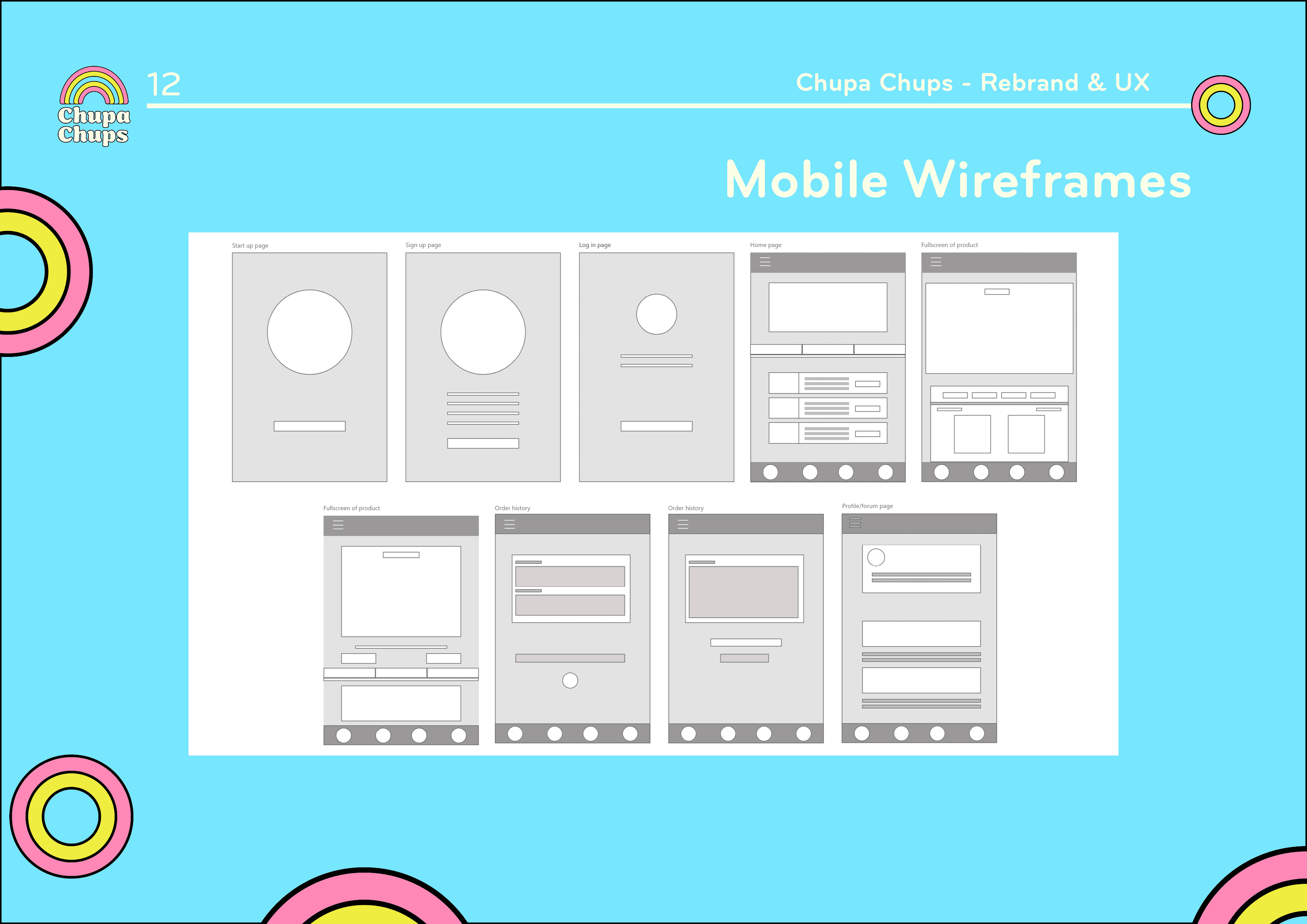
Wireframes were created for the mobile app, focusing on intuitive navigation and clear access to product information and community engagement. Prototypes tested the placement of key features to enhance readability and usability. The final UI design blends a vibrant, modern look with easy-to-navigate layouts, aligning with the updated brand identity.

Stage 1. User Research

Two distinct user personas were developed to capture the diverse target audience. One persona represents nostalgic, older consumers who seek familiarity and simplicity, while the other is a younger, tech-savvy user looking for fun, inclusivity, and seamless digital interaction. Understanding these personas' goals, motivations, and frustrations guided the design process to ensure the brand connects with both demographics.

Stage 2. Ideation & Conceptualization

Several logo designs were sketched to reflect the brand’s modern, playful identity with a rainbow element symbolizing diversity. A color palette was chosen, featuring cream white for warmth, pink for nostalgia, yellow for energy, and blue for calmness. User journey scenarios were mapped to visualize key interactions, such as signing up, browsing products, and engaging with the community.

Stage 3. Design Execution

Wireframes were created for the mobile app, focusing on intuitive navigation and clear access to product information and community engagement. Prototypes tested the placement of key features to enhance readability and usability. The final UI design blends a vibrant, modern look with easy-to-navigate layouts, aligning with the updated brand identity.

Stage 4. User Testing & Iterations

User testing sessions were conducted across different age groups to evaluate the app’s usability and effectiveness. Feedback was analyzed and applied to improve the design, ensuring accessibility for older users while maintaining a dynamic experience for younger consumers, optimizing the overall user experience.

Stage 5. Final Presentation and Documentation

A comprehensive digital rebranding and UX book was produced, detailing the project’s concept, research, design sketches, and final mobile UX designs. The documentation also includes the new logo, branding guidelines, and high fidelity wireframes, showcasing the transformed brand identity.

Reflections

The challenge of balancing Chupa Chups’ nostalgic value with a modern and playful aesthetic became a core focus. While the older audience appreciated the familiar aspects of the brand, the inclusion of vibrant elements like the rainbow and diverse color palette successfully made the brand feel fresh and relevant for younger consumers. This delicate balance informed many design decisions, ensuring that neither group felt alienated.

This project also illuminated how Chupa Chups, as an older established brand, can evolve into the digital space. The shift towards mobile-first UX design with strong community engagement elements demonstrated how an established brand can maintain its roots while appealing to the social and mobile habits of today’s consumers.

Click here to see the full book!

Reflections

The challenge of balancing Chupa Chups’ nostalgic value with a modern and playful aesthetic became a core focus. While the older audience appreciated the familiar aspects of the brand, the inclusion of vibrant elements like the rainbow and diverse color palette successfully made the brand feel fresh and relevant for younger consumers. This delicate balance informed many design decisions, ensuring that neither group felt alienated.

This project also illuminated how Chupa Chups, as an older established brand, can evolve into the digital space. The shift towards mobile-first UX design with strong community engagement elements demonstrated how an established brand can maintain its roots while appealing to the social and mobile habits of today’s consumers.

Click here to see the full book!

Other projects

Rebrand & Website Redesign: Next Pulse Marketing

Refreshing the brand identity and building a modern, AI-focused website with a sleek logo, bold colors, and a futuristic user experience.
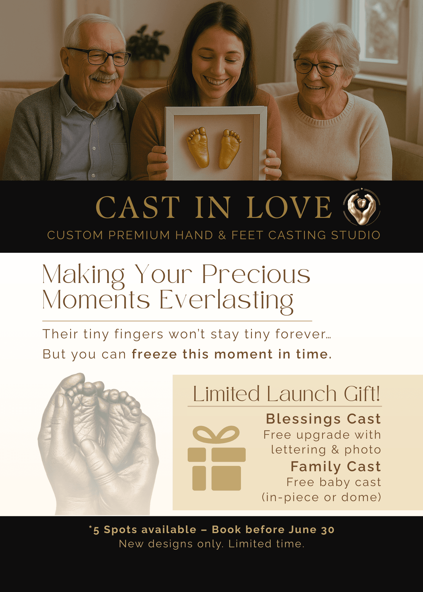
Print Marketing Design for Cast In Love

Print and promotional materials for a hand casting studio focused on emotional storytelling and seasonal campaigns.

5 Fun & Unique GTA Activities – Local Discovery Carousel

Content-driven social media post created to engage local audiences and promote Cast In Love through helpful, shareable content.

Brand & Website: Next Pulse Marketing

Developing a bold visual identity and modern website for a growing marketing agency, with a focus on clean design, intuitive navigation, and a tech-forward feel.

Photo Sorting App: Pixel Pond

Designing an app that will provide all users with a fun and quick way to sort photos and free up space on their devices.

New Vape Flavor: Mexican Mango

Design a logo and packaging for a new vape flavor.

eCycle logo and a bike

Case Study: eCycle

Creating a seamless electric bike rental experience for users through the eCycle app.

Ferrero Rocher Motion Package & Brief

Designing a Motion Package in After Effects for Ferrero Rocher's baking workshops.

Logo Development: Chupa Chups

Redesigning an exisiting logo.

Logo Development: Next Pulse Marketing

New logo design process.

XP Bottle Storyboard

Diegetic UI Element: XP Bottle

Creating a unique diegetic user interface element using multiple inspirations.

Animated Personal Logo

Logo animation loop created in After Effects.

Maya: 3D Breakfast Scene

Created 3D props and textures from scratch to create a realistic breakfast scene.

Stylized Profile Images

Created unique variations of profile picture for a client, utilizing multiple layers and textures.

Animated Poster Loop

Animated Poster Loop created in After Effects.

Viktoriya Epifantseva

Viktoriya Epifantseva

Viktoriya Epifantseva

Create a free website with Framer, the website builder loved by startups, designers and agencies.